flashlight.jpg

Urban Archive

Urban Archive

Project: Client UX/UI Design Sprint
Length: 2 Months

Deliverables:
On-site interviews
Personas
Service blueprint
User testing
User Flows
Style Guide
Multiple Iteration Design

Focus: iOS App Experience

About

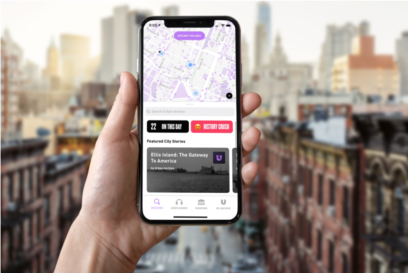
Urban Archive is an NYC tech nonprofit fostering connection between people, places, and cultural institutions. The UA app features tours in established museums, museum curation, and GPS based historical information pinged around buildings across NYC.

Process

This design sprint focused on research, design, and subsequent testing, which then informed the next iterative feedback loop.

Personas

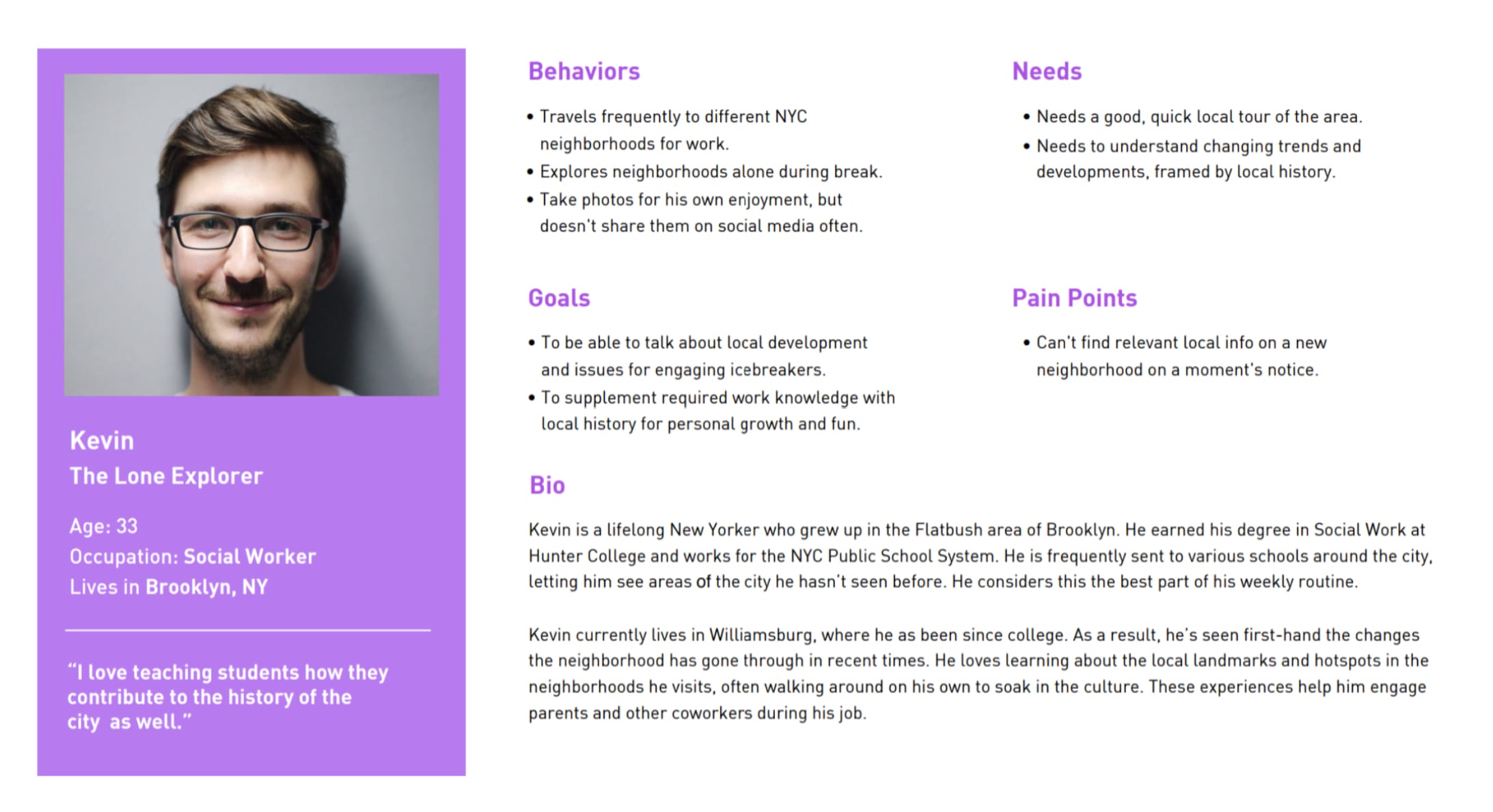
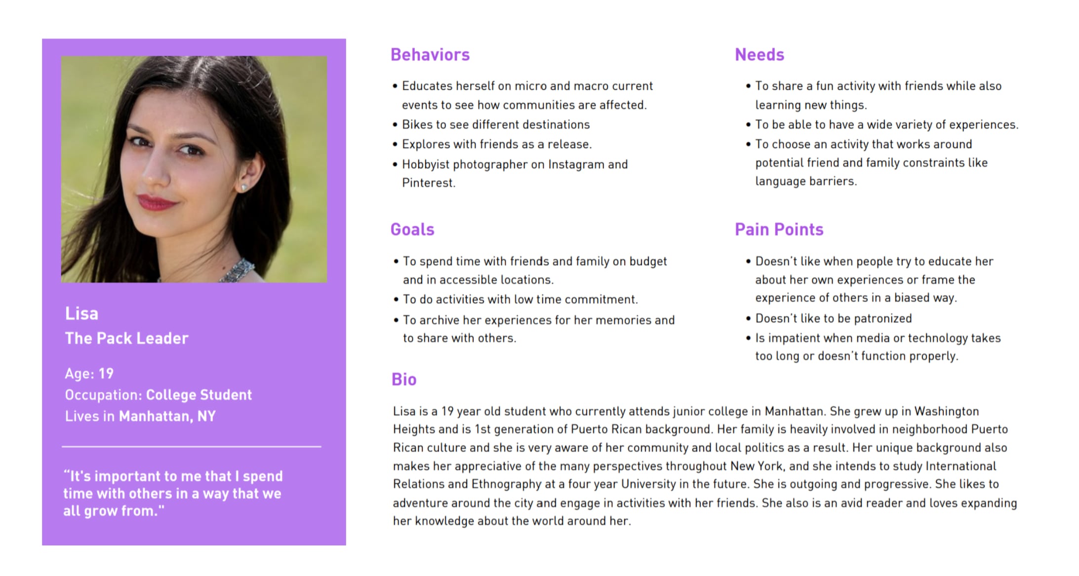
Personas were developed from 10 informational interviews and in field observation at the museum of the city of New York (Where Urban Archive held a free interactive tour on the pathogen exhibit.).

Affinity Mapping

We took the qualitative data from our interviews, user tests, and field notes at the museum, and aggregated it in order to find patterns.

Industry Comparison

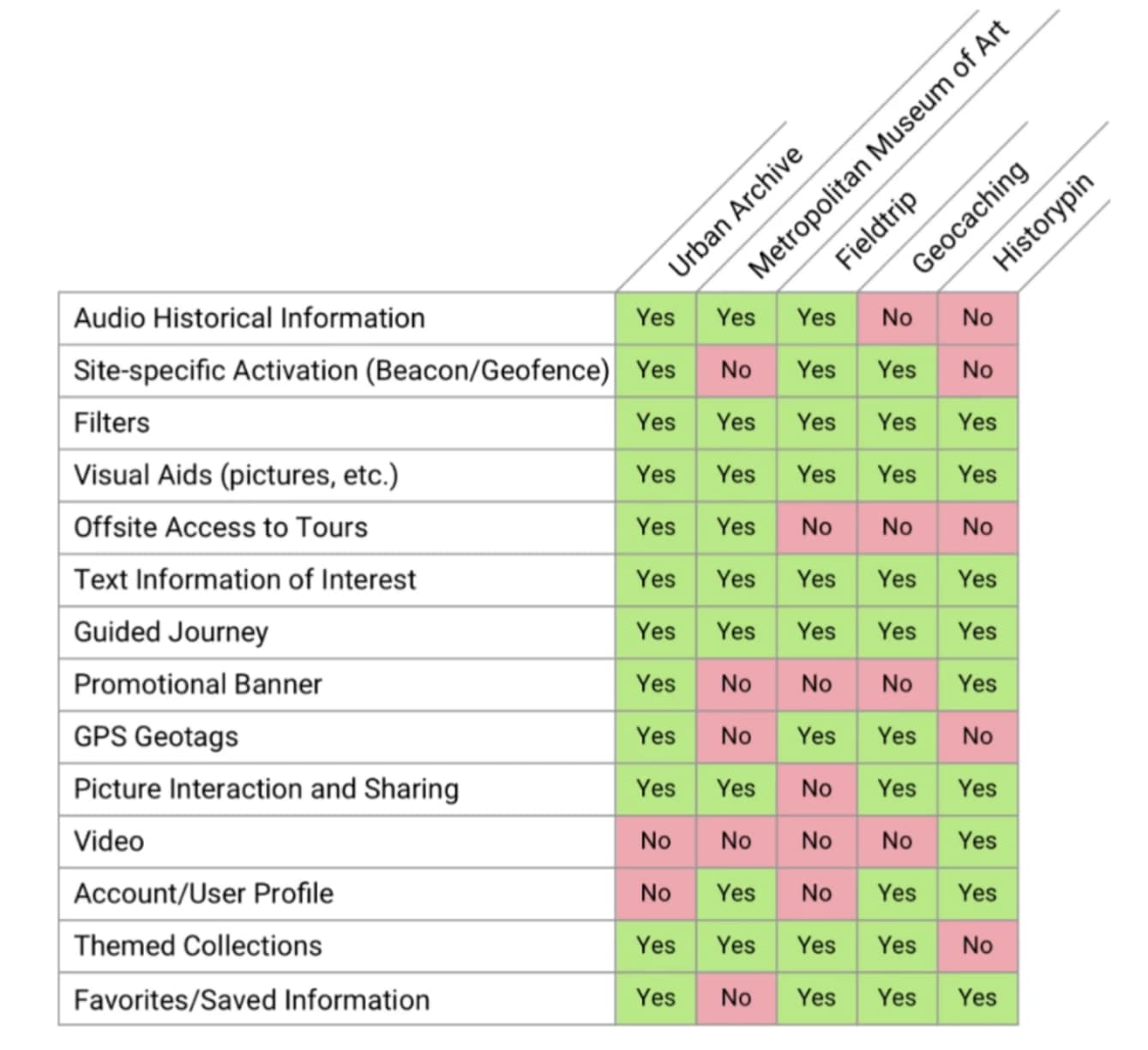
We compared museum industry examples with our client.

Testing Round 1

First we Tested the Success of the original App in order to get clear metrics about performance, and have a control.

Revised Problem Statement

New Yorkers experience the growth and evolution of their city firsthand. Many wish to learn about the city's history for their own personal development or social engagement, but in an authentic and accessible way. Common roadblocks when engaging in a museum or walking tour include limited time, lack of control over the experience, or language barriers...

How might we construct a consistent self-guided tour experience about the history and evolution of NYC, for people who value exploration as a social activity or solo endeavor?
Open Card Sort, (mental model hierarchy of categories)

7 participants, 41 pieces of content. Avg groupings, synonyms used when direct label not applicable.

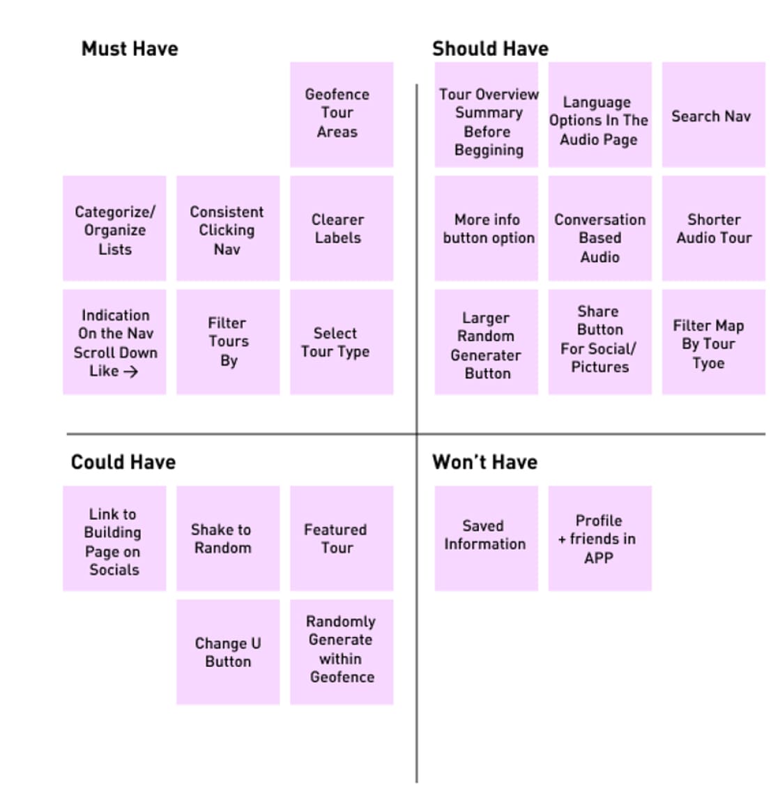
2x2 Priority Matrices

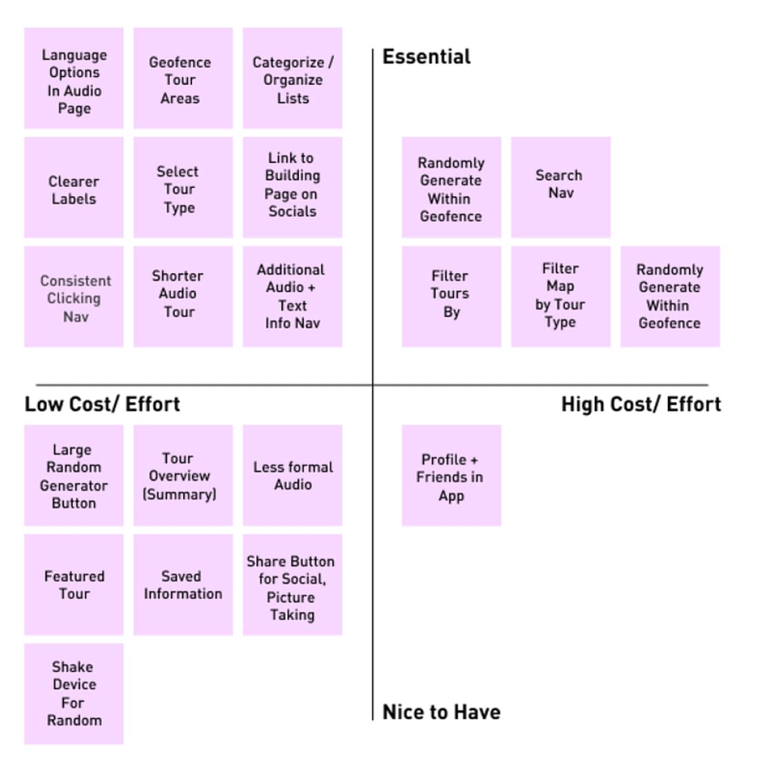
Utilized two systems in order to derive what features proved most critical, economical, and feasible.

2x2 Priority Matrices Cont.

Utilized A MOSCOW Matrix to determine what was most beneficial to the user and bottom line.

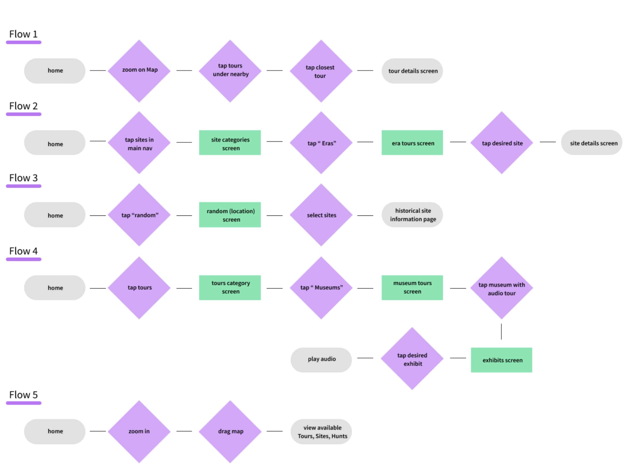
Task Flows

Developed to model the most ideal path in the museumgoer's journey.

User Flows

This flow modeled user behavior and every possible outcome

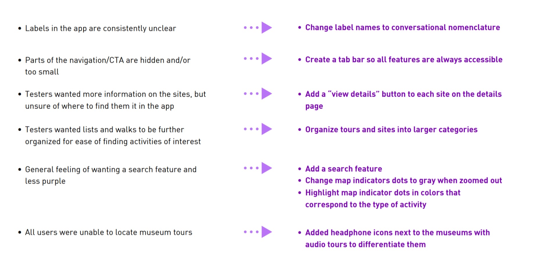
Testing Insights

Based on our testing results with the existing app, and the information gathered from our interviews, we formatted specific changes within the new app design.

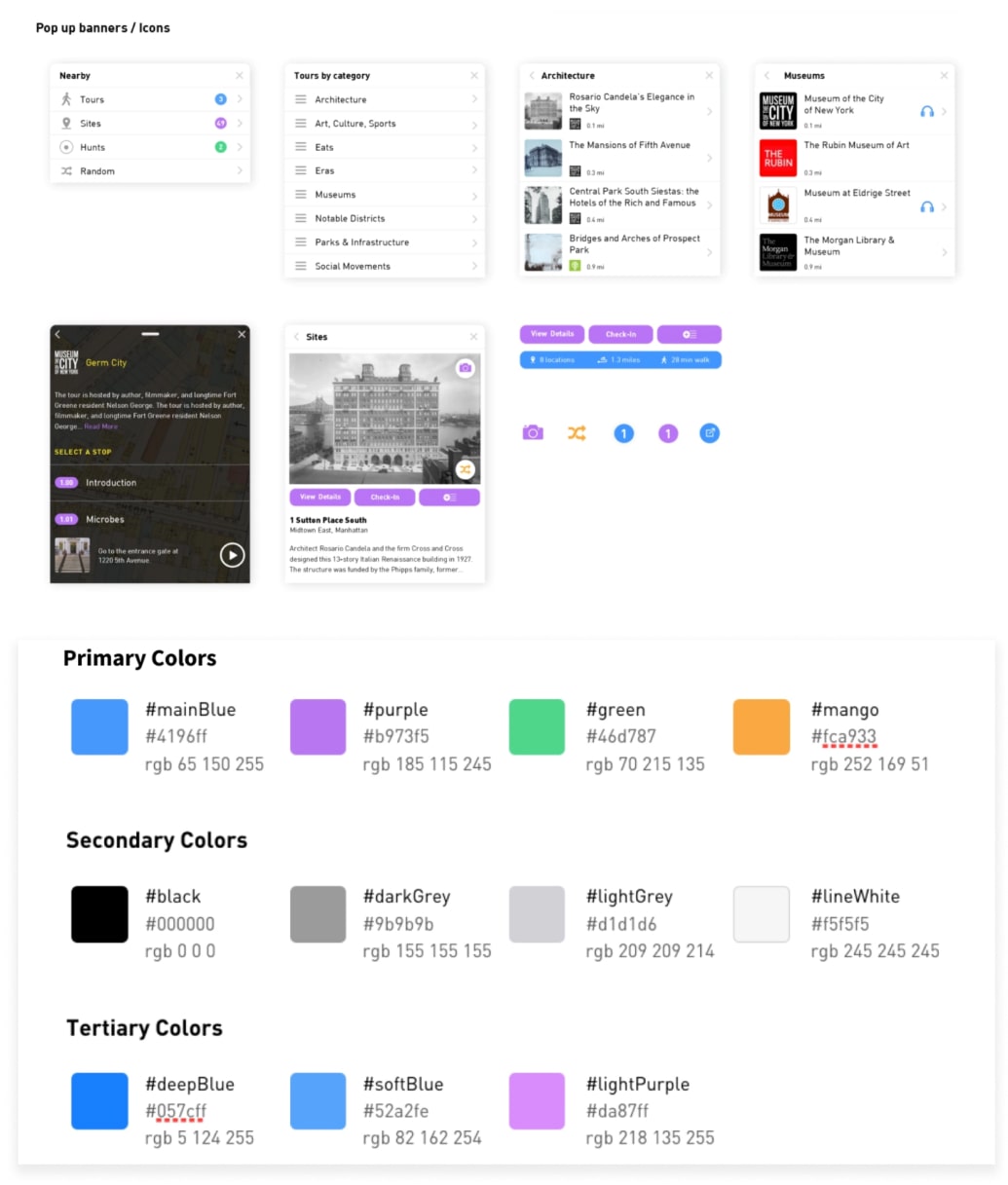
Style Guide

We took these feature ideations into account as we modernized the styleguide of the app and brand at large.

App Design

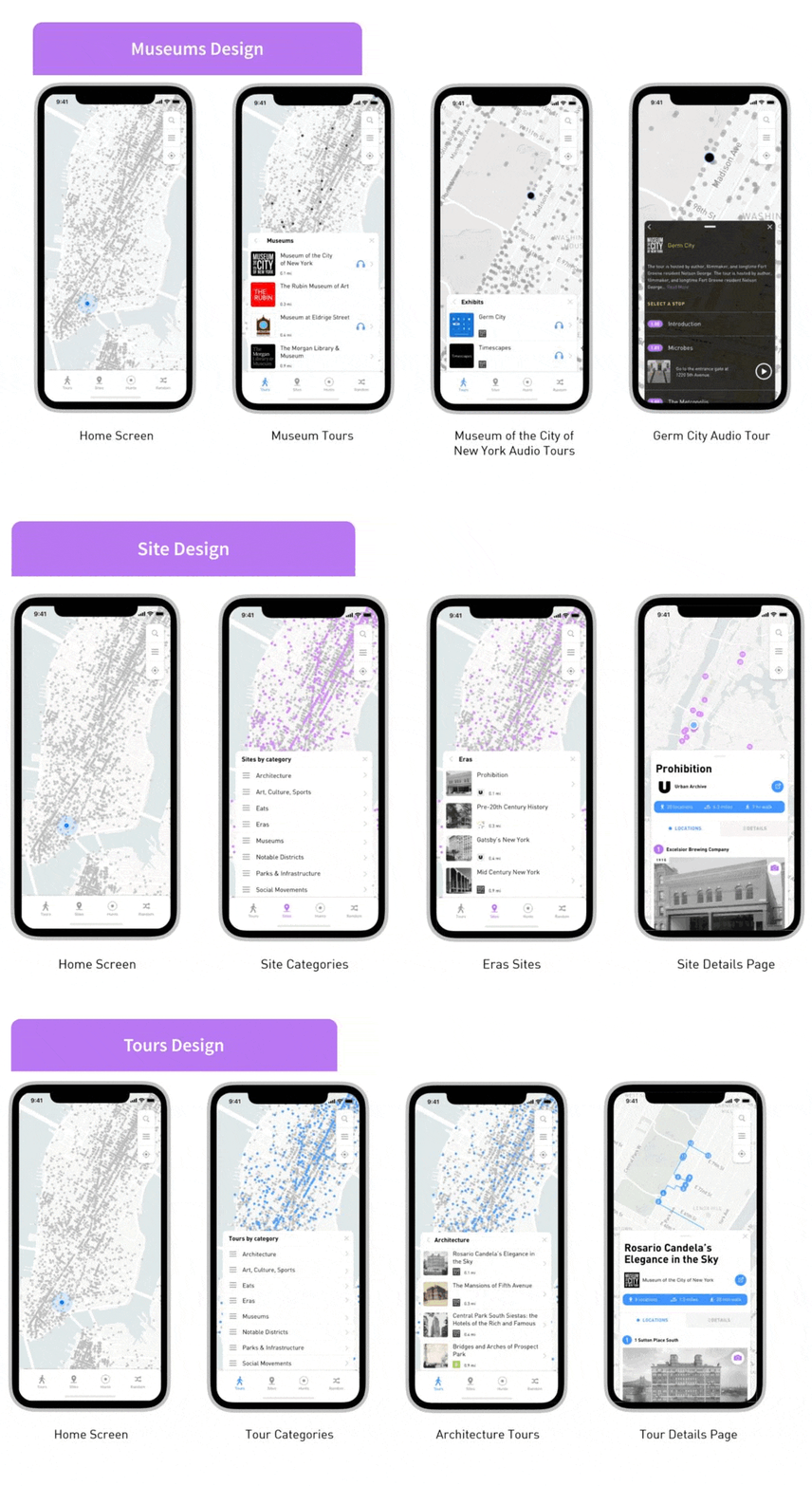
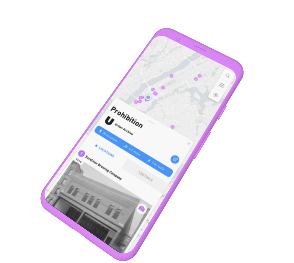
Finally, we developed these features into our app design, segmenting tours and sites and thereby simplifying the information architecture.

Testing Round 2

We performed a second round of testing with our new app designs as a prototype, in order to see if there were any improvements from the control.

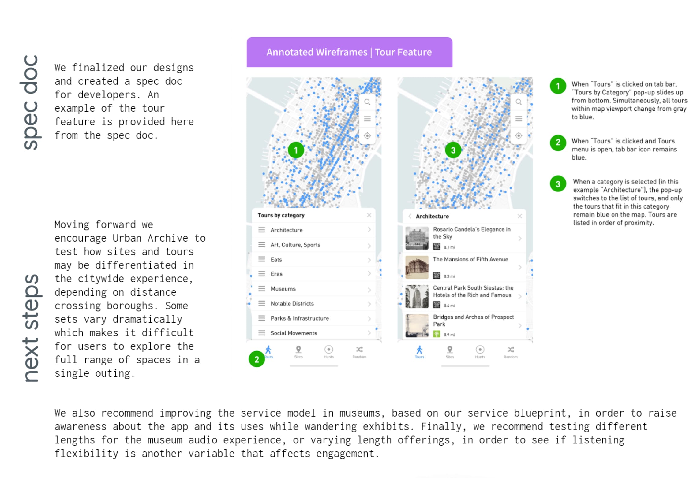
Spec Doc

After testing the app and determining it was an effective design, we formatted a spec doc to pass along to the development team.

Service Blueprint and Next Steps

Moving Forward, we brainstormed a service blueprint in order to potentially improve the onsite experience at the Museum of the City of New York.